
From the Series: Video Without Vision
This final episode shows how the accessibility tree turns a video player into something blind users can press, play, and enjoy.
This is for curious readers, as well as Accessibility Experts, Developers, and Testers.
Blind people use screen readers to navigate and operate videos. When they do, the screen reader checks what type of control each part is. It looks for the type of button, its name, and whether it is open. It does not rely on how things look. It relies on what the website tells it.
This information comes from something called the Accessibility Tree. The webpage is the trunk, the video player is a main branch, the controls are smaller branches, and the content is the leaves. Trees make useful analogies because they can hide bugs and all sorts of critters.
This gets technical for good reason. If you’re up for a challenge, read on. We’re here to help, not to scare you off.
We’ll look at WCAG rules that help keep things in the tree organised and easy to recognise.
WCAG Robust: 2 Rules for Blind Video Access
The WCAG Principle Robust includes two rules that apply to making video players accessible for blind users:
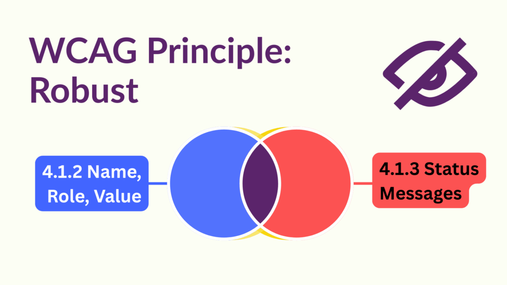
Let’s unpack these in plain language.
Does Your Video Have Controls?
If your video is decorative and has no controls, and you’ve met earlier episodes, congratulations because your video is accessible to blind users.
For everyone else we have to consider the following:
- Controls must clearly tell screen readers what they are, what they do, and whether they can be changed by the user
- Status messages must be written so that screen readers and other assistive technologies can understand and announce them clearly
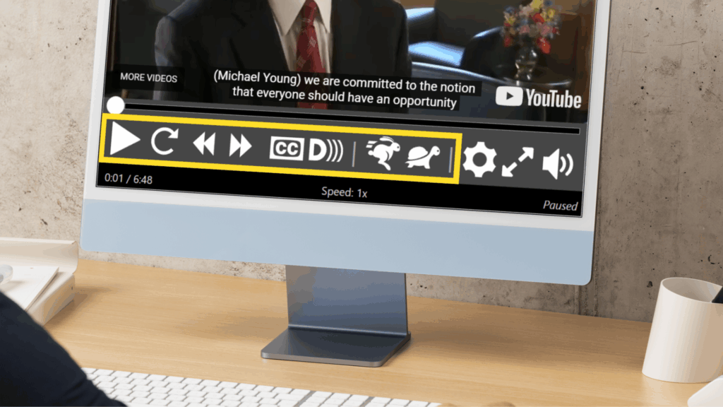
Video players often include different types of controls. Some trigger actions, while others let users make choices.
All controls must be built so that screen reader users can understand and predict how they work. This means following official specifications.
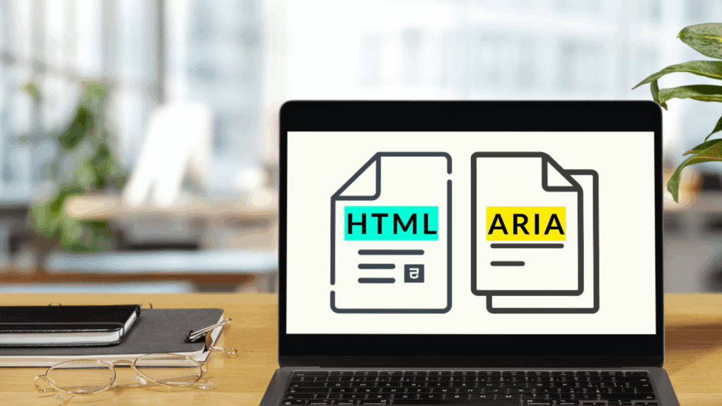
The HTML and ARIA specifications explain how to build controls that work reliably across assistive technologies. These include desktop screen readers such as JAWS, NVDA, and Narrator, and mobile screen readers such as VoiceOver for iOS and MacOS, and TalkBack for Android. Users may be using any version of these tools.
Consistent specifications are essential. They help ensure that behaviour is predictable across all platforms.
Standard Buttons
Most video player controls are buttons that trigger actions like Play, Fast-forward, or Mute.
Blind screen reader users must be able to access both the name and role of each button. This helps them understand what the button is and what it does.
In video players, buttons are usually shown as icons. Their accessible name often comes from the icon’s text alternative or from an aria-label. That’s fine, as long as the name clearly describes what the button does. For example, use “Play” for a play button.
In addition to identifying the button, screen readers need to know its role to know what type of widget it is.
The simplest way to do this is by using the standard HTML <button> element, which automatically carries the role of “button”.
Simplified example of a native button:
<button ...>If you cannot use <button>, you must add role="button" to your element to ensure it is recognised correctly. This is not the end of the world, but it won’t come with any bells and whistles. You’ll need to create that via scripts as well as ensuring it is keyboard accessible, including activating with the SPACE key.
Basic example of an ARIA button using a link with some keyboard support:
<a href="#" role="button">Reveal Buttons
Some video players include other types of buttons, such as a control that reveals extra options. This is often shown as a settings cog icon.
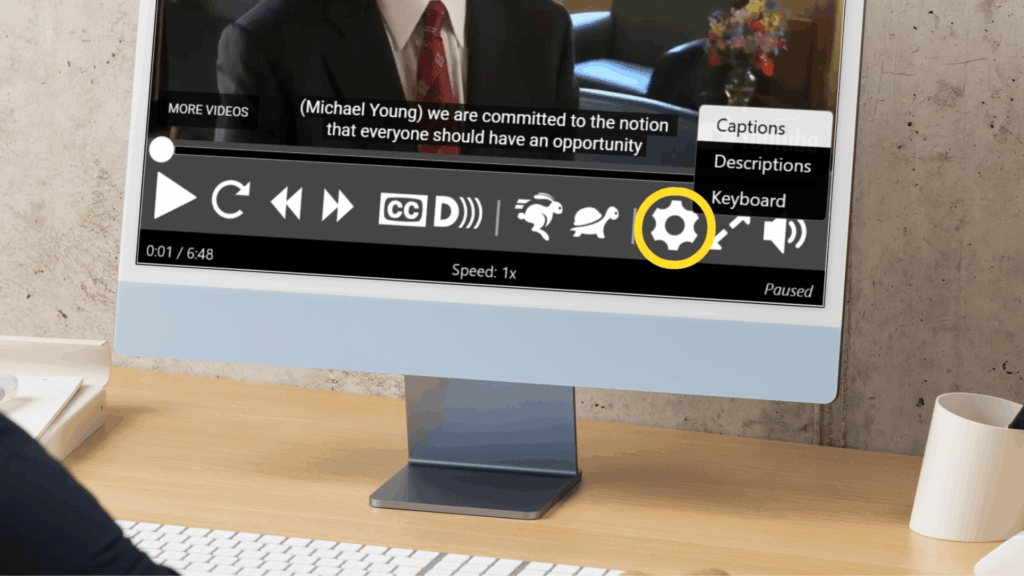
This type of control is known as a menu button and displays a list of options when activated.
It must meet the same requirements as standard buttons, plus a few more:
- Users must know has a menu
- Users must know when the menu has been opened
- Users must know what kind of widget each option is
- Each option must have a clear name
Menu Popup
The aria-haspopup="menu" (or aria-haspopup="true") attribute is placed on the menu button itself. This tells screen reader users that activating the button will reveal a menu of options.
Simplified example of the popup type:
<button ...aria-haspopup="menu">Menu Open
The aria-expanded attribute is placed on the menu button itself. Set it to true when the menu is open, and false when it is closed. This lets blind users know whether the options are currently visible.
Simplified example of the revealed state:
<button ...aria-expanded="true">Simplified example of the hidden state:
<button ...aria-expanded="false">Option Type
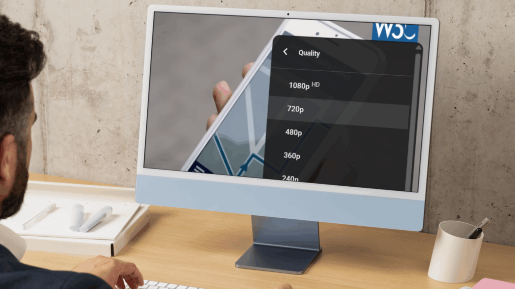
The type we set will depend on what the option does.
menuitemperforms an action when selectedmenuitemcheckboxselects or deselects an option; multiple checkboxes in the group can be selectedmenuitemradioselects one option from a group; only one can be active at a time
In the case of checkboxes and radio options, the checked states must be conveyed by the tree via states via aria-checked.
Options must be grouped inside an element with role="menu".
Here’s a simplified example of quality options with SD selected:
<div role="menu">
   <div ...role="menuitemradio" aria-checked="true"> Standard Definition (SD) </div>
   <div ...role="menuitemradio" aria-checked="false"> High Definition (HD) </div>
</div>
Option Name
The name of each option should be clear and come directly from its value. If you use plain text and the correct role, the accessibility name is automatically set. For example, in the previous simplified quality options, the names are “Standard Definition (SD)” and “High Definition (HD)”.
All together we have something that looks like this:
<button aria-label="Settings" aria-haspopup="menu" aria-expanded="true">...</button>

<div role="menu" style="display:block">
  <div role="menuitemradio" aria-checked="true"...> SD </div>
  <div role="menuitemradio" aria-checked="false"...> HD </div>
</div>
Technical note: We left out aria-controls on the menu button and aria-labelledby on the menu to keep things simple. These attributes are not required to meet WCAG, but they can help screen reader users. To learn more, see the ARIA specification and the APG Menu Button example.
Sliders
Most video players use a slider for the timeline. If there are detailed volume settings, you might find another slider for that too.
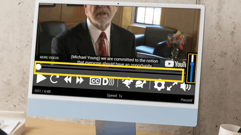
The slider lets users choose a point within a range, like 10 minutes into a 20 minute video.
Blind screen reader users must know:
- What the slider is for
- Know it is a slider
- What value it is set to, in context
What the Slider Is For
Even if your video player has only one slider, it still needs a name. Sighted users may see it as the timeline, but blind users will not know unless it is labelled.
Sliders often appear without a visible label, so the best option is to name it using aria-label.
Example with two sliders: one for the timeline, one for volume.
aria-label="Timeline"
aria-label="Volume"
Know It Is a Slider
Blind screen reader users must be able to recognise that a slider is a slider. This depends on how its role is conveyed.
There are two common approaches. One is a custom slider pattern, though support on Android has been patchy. The other is a native HTML input element. Both expose the correct role, but the native input offers wider accessibility support.
To convey the role with a native input, set its type to range. This automatically gives it the role of slider.
Simplified example of a native slider:
<input ...type="range">What Value It Is Set To, In Context
Sliders let users pick a point within a set range by moving a thumb control.
Blind screen reader users need to hear the current position of the thumb, both when the slider loads and as it moves. They also need to know the minimum and maximum values.
This is handled using HTML attributes:
min: the start of the rangemax: the end of the rangestep: how far the thumb moves with each changevalue: the current position of the thumb
Each attribute helps screen readers describe the slider clearly and accurately.
Simplified example of a thumb point half way through:
min="0" max="20" step="20" value="10"Here’s how the complete slider might be structured:
<input
  aria-label="Timeline"
  type="range"
  min="0"
  max="20"
  step="20"
  value="10">
Let The Message Through
A status message is a short update that appears while something is happening. It tells the user what worked or what didn’t. You don’t need to press anything to remove it.
For example, on YouTube, pressing the RIGHT ARROW key while focused on the timeline nudges the video forward. A message like “5 seconds” appears with an icon, confirming the jump.
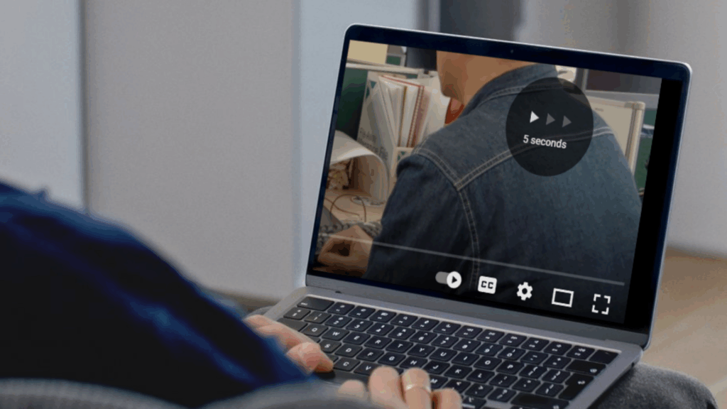
The main goal here is to make sure blind screen reader users can hear status messages.
To do this, apply role="status" to the container that holds the message. Because of a screen reader quirk, the role must be present for a few seconds before adding any content.
When used properly, screen readers will announce the message as soon as they can, without breaking the user’s flow. This works well for short updates like confirmations or small errors.
Simplified Example of a status message:
<div role="status"> Fast-forwarded 5 seconds </div>Congratulations! Your Video Is Now Accessible to Blind People
Well done for completing our series!
Depending on how your videos were built, this may have been a long road and one that you can be proud of.
Please do not underestimate what you have achieved. Making your videos accessible to blind people is a meaningful step towards inclusive design. Be proud of that. Many people never even read about accessibility. You stayed the course. That matters.
If this series helped you, share your achievement on social media. Tag us with #TabAble or find us on LinkedIn under @tab-able. Let others know your video now works for blind people.