Bright colours can make information more engaging. But if not used with care, they reduce legibility.
Accessibility Issue
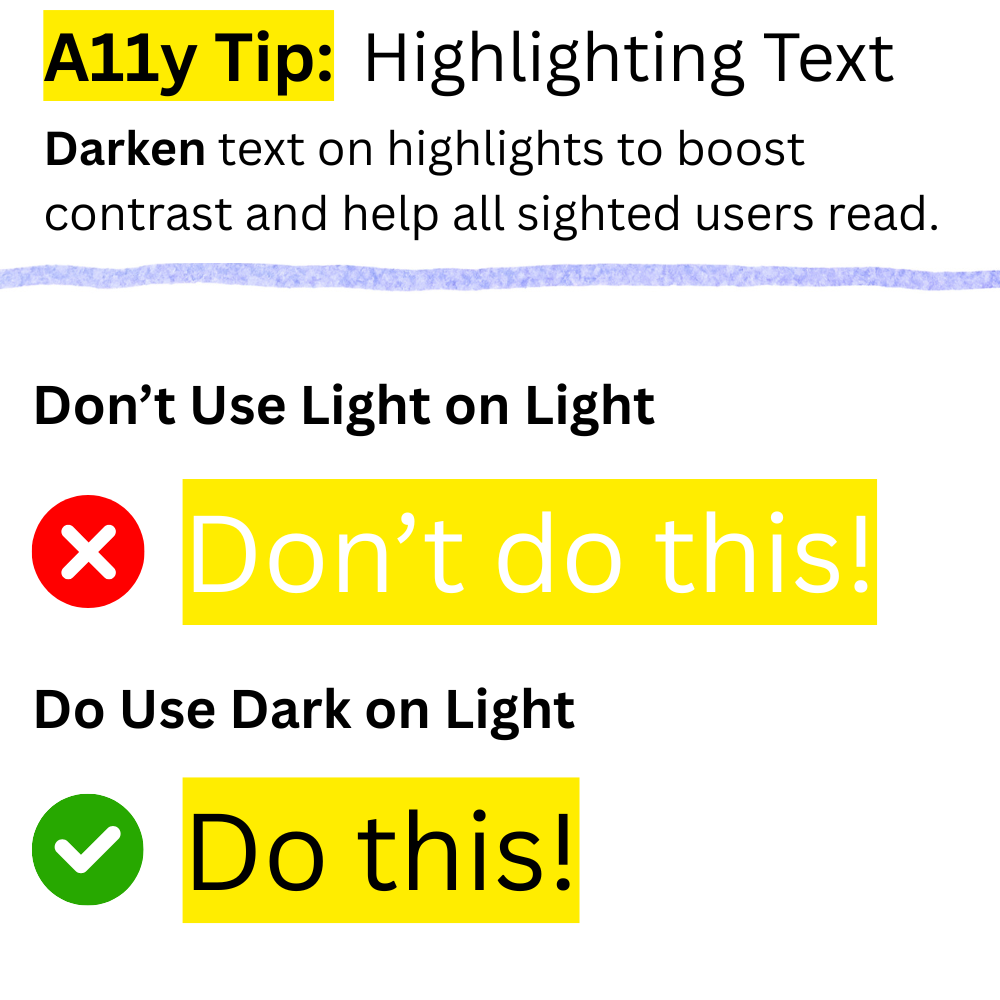
Bright text on bright backgrounds can be hard to read, especially when the contrast ratio falls below 4.5 to 1.
An example of this is when white text is used on yellow highlights.

Who It Affects
- People with low vision that cannot easily distinguish light colours.
- Anyone using their device on a bright day with sunlight hitting their screen.
Accessibility Tip
Darken text on highlights to boost contrast and help all sighted users read.
For example, instead of using white text on yellow highlights use black text.

WCAG Contrast Requirements
Good text contrast is a requirement in WCAG Success Criterion 1.4.3 Contrast (Minimum).
- Regular text (below 24px) has a minimum contrast ratio of 4.5 to 1.
- Large text (24px or above) has a minimum contrast ratio of 3 to 1.
The contrast threshold for both regular and large text must be met. Even falling short by 0.1 means it does not count. This threshold marks the point where people with low vision can read text.