
Despite being an older design pattern, Floating Form Labels continue to be widely implemented today, making them just as relevant as ever.
You might wonder why I am revisiting this topic, but the reality is that this pattern was originally developed to address real user needs, and understanding its accessibility impact remains crucial.
Floating Labels, a design pattern from Google’s Material Design assists users in recognising form fields, or so the pattern claims.
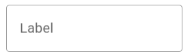
This pattern places labels inside form fields when they are empty, allowing users to quickly understand what is expected of them.
Here’s an example of a floating label sitting inside of an empty form field.
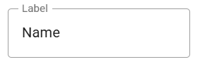
As data is entered, the label visually moves above it and seems to float on the bordered boundary of it.
Google ran a study with 600 participants that found Floating Labels helpful, so there is merit to the pattern. However, Material Design’s own guidelines outline certain drawbacks, offering a balanced perspective on its effectiveness.
Why do accessibility issues arise with Floating Labels? Is it a lack of awareness among designers, or is there a deeper flaw in the pattern? Unfortunately, both.
“Keep it short, clear, and fully visible”
If we are to use this successfully, Google asks that we “Keep it short, clear, and fully visible“. This is to prevent text from wrapping onto multiple lines, but isn’t always within our control.
The floating effect requires placing elements over other content. When we float things, we introduce the risk of obscuring important information on the page.
That risk comes in when we have to consider text dynamically changing in size.
Users with low vision or cognitive disabilities may increase text size or adjust spacing to suit their reading needs, while others may switch to languages with longer words.
These modifications often cause text to flow onto multiple lines, and when that happens, the floating label can obscure the form field beneath it.
On a website’s account creation form, I encountered this issue while using my iOS device with Larger Text settings enabled. The label “First Name (you may need to add a middle name)” wrapped onto two lines, obscuring the field and preventing me from seeing what I was typing.

In an ideal scenario, the instruction “you may need to add a middle name” wouldn’t have been part of the label. However, this example effectively illustrates how Floating Labels can create accessibility challenges, especially when text expands and wraps onto multiple lines.
How Serious Is The Issue?
Floating labels often use opaque white backgrounds to enhance their floating effect while keeping text legible. However, this opacity can obstruct the form field beneath it, making it difficult for users to verify their input.
Without clear visibility, people may struggle to confirm whether their entries are accurate or formatted correctly. This can lead to frustrating trial-and-error processes or even submission of incorrect information.
The impact is especially significant for users with disabilities who may be unable to adjust their devices to compensate.
Some people lack the ability to rotate their screens for a larger view, while others rely on magnification or large text sizes to navigate interfaces effectively.
For these users, floating labels can present an insurmountable barrier.
Ensuring Accessibility with Floating Labels
Google has laid the foundation for the floating label pattern by recognising and addressing a user need, but there’s still more to be done.
To achieve this, we need to extend user studies to include individuals with low vision and cognitive disabilities, ensuring accessibility remains a priority.
By working inclusively, this pattern could undergo a fundamental transformation.
It may evolve beyond floating labels altogether, adapting to better meet the diverse needs of users. What remains paramount is achieving the ultimate goal: helping people easily and effectively identify form fields.
WCAG Supports Accessible Form Labels
The Web Content Accessibility Guidelines (WCAG) provide essential principles, guidelines, and criteria to ensure people with disabilities are considered in design.
Guidelines are crucial, as anyone, including individuals with compound disabilities, could be interacting with our form at any time.
We should pay special attention to the following success criteria (SC) to better support individuals with low vision and cognitive disabilities:
- Resize text (SC. 1.4.4)
- Reflow (SC. 1.4.10)
- Text spacing (SC. 1.4.12)
- Headings or labels (SC. 2.4.6)
- Labels or instructions (SC. 3.3.2)
Ultimately, it’s up to us to ensure that the patterns we implement are well-suited to the needs of our audiences.
Image Credits
The featured image used in this article is credited to Pramod Tiwari.