-
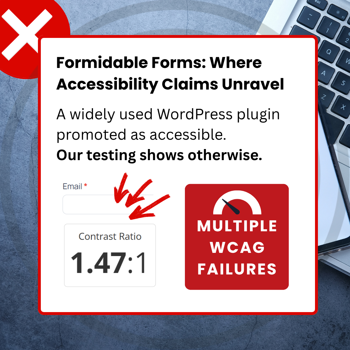
Formidable Forms: Where Accessibility Claims Unravel
-
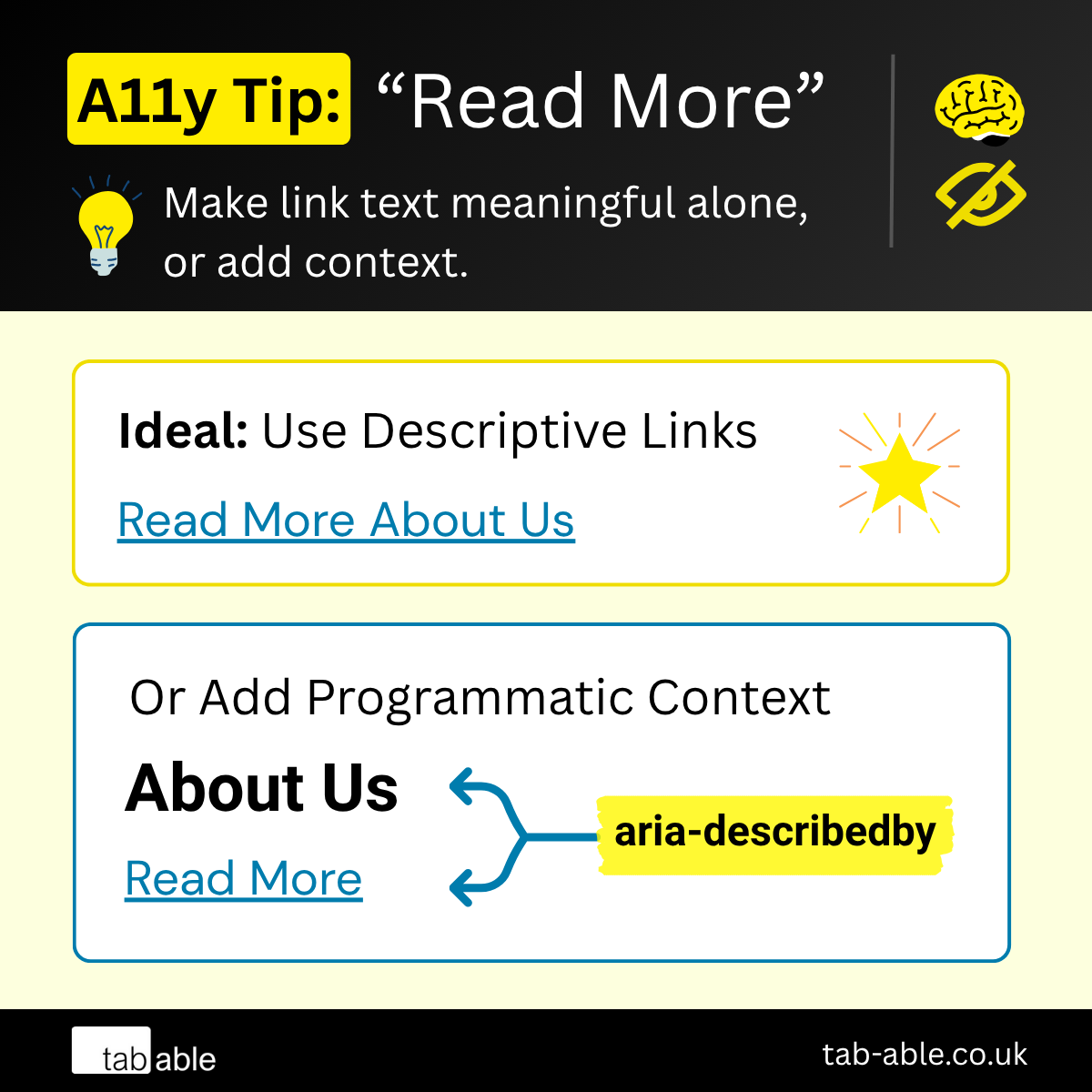
A11y Tip: “Read More” Links
-
Episode 5: The Tree That Endures

-
Episode 4: Preventing “Wait, What?”
-
Video Without Vision

-
A11y Series
-
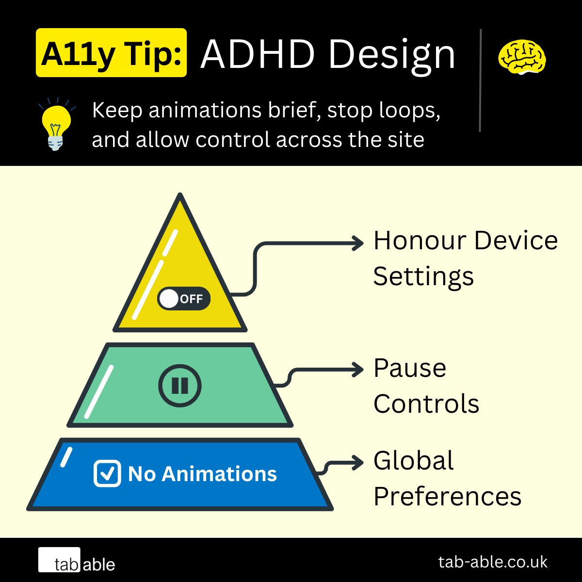
A11y Tip: Designing For ADHD
-
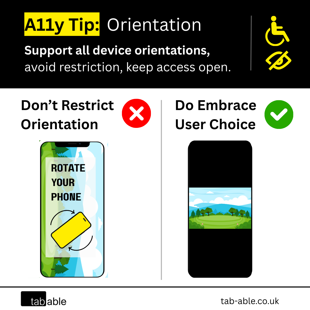
A11y Tip: Device Orientation
-
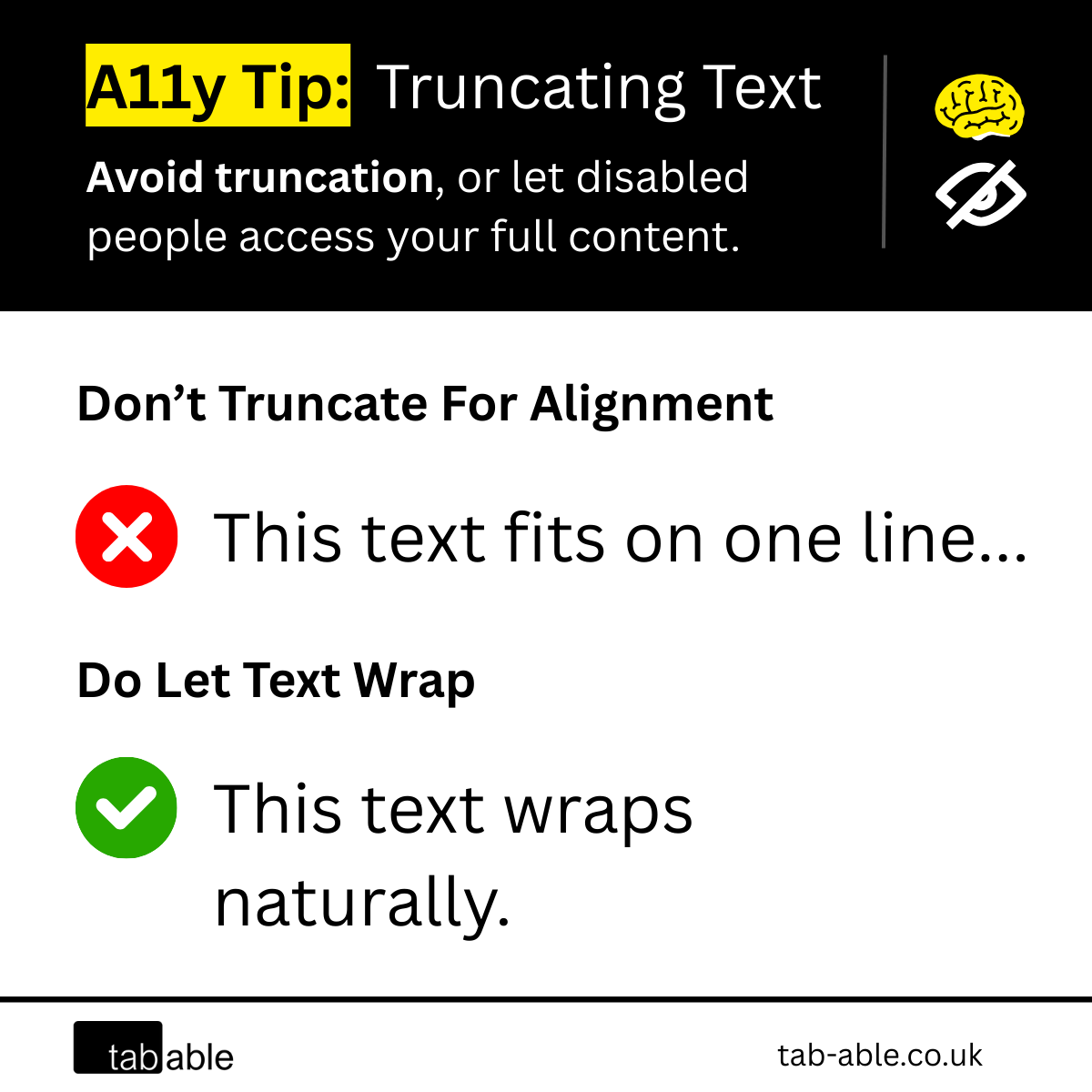
A11y Tip: Truncating Text
-
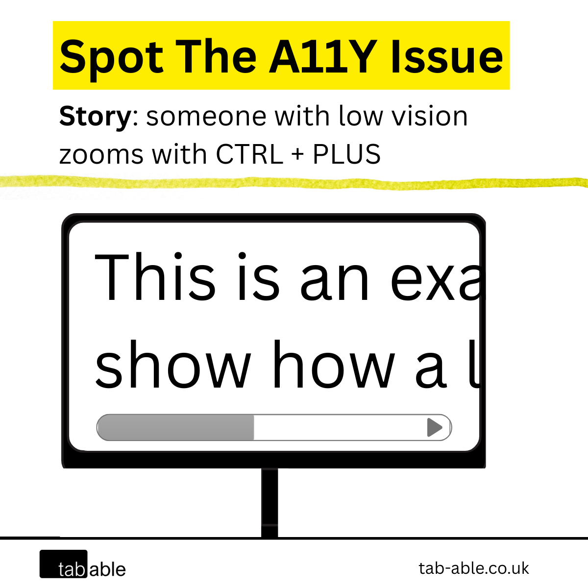
Can You Spot The A11y Issue: Low Vision

Your Trusted Digital Accessibility Consultancy
Author: Andrew
Everything We Offer in Accessibility
Accessibility Quick Check
The Accessibility Quick Check is, as the name suggests, a fast, high‑level review.

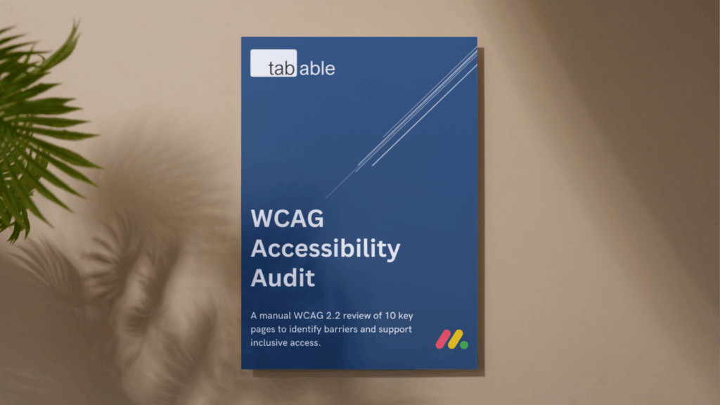
WCAG Accessibility Audit
The WCAG Accessibility Audit is a manual review of your website or app, measured against WCAG 2.2 standards up to Level AAA.